I’ve noticed a trend at conventions just based on how people pick up or don’t pick up my books when they walk by: For Steam And Country requires double the amount of books as Star Realms: Rescue Run. Now both of these covers are absolutely beautiful, not complaining about the Star Realms cover in the least, but the cover differential is 100% the reason for it, so it’s worth analyzing.
It started getting me thinking about covers and how important they are to your selling. A lot of indie authors don’t want to spend much money on covers, or simply can’t, and that comes across in the product. A good, professional looking cover on an indie level is going to cost $500-1500, there’s no way around it. And while doing a lot yourself is a good cost cutting measure, this marketing piece which is the big first impression that everyone sees on your book for eternity is not a spot you can skimp.
I’ve seen so many indie books that even if they look clean on the cover (most don’t), they don’t have any sort of grabbing wow factor that makes people stop. This is a problem for your bookselling. There is no better way to convince someone who hasn’t heard of you that your product is pro and worthy of their time than having it look pro and worthy of their time.
Looking at Star Realms, there’s a reason why it doesn’t do quite as good as For Steam And Country in the walking-by-cover department. I’ll put the covers up for you here:
There’s very similar elements to both covers. Both are very thematic so a reader is advertised exactly what they can expect from the books (super important!). Both have a beautiful woman on the cover, both have really good artists who rendered them, some of the best in the business actually, but your eye is naturally drawn to For Steam And Country immediately. I believe there’s a few reasons why and this can help you think for your cover design in principle:
- Colors. This is probably the most important point, believe it or not. For Steam And Country has a bright yellow background. That draws the eye, it’s that simple. The dark grays of Star Realms are out of focus on first glance — there is a the logo’s red which helps as a focal point, but not much else.
- The logo looks more fun. While they’re both very thematic, which is good because you want to signal to your readers what they’re reading, Rescue Run looks cold, metallic, almost sterile. For Steam And Country has frills and flows with excitement.
- Busy vs. space. For Steam has a lot of space, and that actually bothered me when I was analyzing it. I thought that it would be a bit much, but the space for the character to breathe on the cover draws you to look at her more because it leaves more to focus on. Star Realms has a lot going on. It’s again, beautiful art, and the playing-card version of it looks even cooler and evokes such a story, but the background figures, the busy ceiling, the different logos everywhere, it makes it hard to really focus on the picture and the beauty of the art.
- Joan is depicted as a hard, strong woman. Zaira is depicted as feminine, a lot less jaded and more inviting. I can see a certain group of people’s heads exploding at this because they’ll get very angry, but it’s true. From the female perspective, most will identify better with the latter. From the male perspective, their hearts will throb more often for the latter. It’s how it is. Think about how the look of your character (or space ship) will impact your readers on a basic, emotional level, because that’s all covers provide for you.
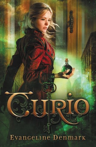
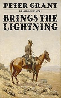
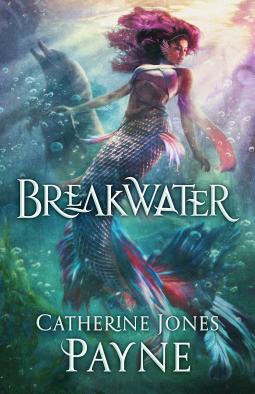
Thinking of covers that evoke that very same “I MUST BUY THIS NOW” emotion in me for similar reasons, you can go over the points above and see how they tie in. Here’s some examples of covers that gripped me:


They all kind of have similar elements to them. A simple focal point, bright colors (even though Brings The Lightning has a faded look to it, it’s pretty bright and thematic), characters that seem to fit interesting ideals, and evocative logos.
Now when I was in the store the other day, I saw a very well-known professional magazine that I thought… well this doesn’t communicate its title, its theme, its feel, or anything else to it. I thought it was a bizarre choice, and it goes to show you that professionals can make big mistakes too:
Yikes. There’s nothing Fantasy or Science Fiction about that. It’s extremely busy. While it does have a bright cover, it looks like something you’d see in a schoolbook or like a pamphlet a teacher would hand out for an SAT question. No fun factor at all to it.
Something to think about for publishers and authors alike. You want the best covers possible for your books, cuz that’s how you’ll sell!


I was taught this early on as a Computer Scientist and an Engineer.
Keep It Simple Stupid.
You should have much of anything, whether it’s your writing, your cover, your game, your music, etc. as complex as it needs to be an no further. It is sometimes hard to figure out where the, “no further,” actually is.
The first cover…you nailed it. Just a bit too busy, a bit too washed out and dark.
The other? You may have initially agonized over it when you first did it, but it’s **PERFECT**- and for the reasons you gave in the article.
Yes! Thank you.
Bright colors are good, but color contrast helps a lot, too. Yellow and red together on For Steam and Country, red and green on Curio, blue-green and purple on Breakwater. Brings the Lightning is an exception, but it matches its genre and draws you for thematic reasons rather than necessarily for color as you mentioned.
Also on cover cost, shopping around you *may* be able to go as low as $200 for a good custom cover, but consider yourself lucky if you can pull that off. One of my friends has a cover artist she keeps to herself because she doesn’t want the artist to get swamped or to have to raise prices.
Great add on comment here — artists look at this!
I actually got the opposite feeling for Joan and Zaira’s characters from the covers (haven’t read either book)… But Steam And Country’s cover still holds me more.
In detail, Joan looks to me like a naive humanities major who is about to find out that those ROTC sessions should have been treated as more than just empowerment metaphors. Zaira looks line she’s been through hell and back so many times that the only thing that gets a reaction from her anymore is going through hell again.
That said, nobody ever claimed me to some kind of social, people-person. Or even entirely normal. But I find it very interesting that despite the very different take” the character’s presented, the covers-to include the characters on them-still come off with the same effect.
Also, I’d pick up Steam And Country because the cover of Rescue Run suggests there’s so much about that world that I supposed to know already.
The second cover is better because of the contrast of the figure. The first book would have been better if the artist/designer had lightened the area behind her head and slightly darkened the background characters. It’s like dancing, somebody has to lead, and everything else has to follow, and with this cover foreground and background are fighting for attention.
The first book also has a lot of text, was this book designed to be sold in a bookstore? That extra text might be useful in that setting but is pretty useless on the internet or at a convention where the author is there to do a sales pitch. Both are pretty good, but the second one is better.
It’s a cardgame tie-in. Designed for game stores and cons, mostly.
Good post. I find I respond better to a cover with a person/persons on it. I think particularly in science fiction, you see covers that are very impersonal. (Random ship floating by a planet somewhere in space). I guess that would work on an Arthur C. Clarke cover, but I don’t love it.
I’m debating on my next space opera because floating space ships do actually sell that genre to some extent. Haven’t decided yet 🙂
Been learning much the same through trial and error. Mostly error.
While editing my first novel, I’d walk through brick & mortar bookstores looking at the covers of what was “popular.” What hit me like a cheetah was all those faces! The furthest out anyone was shown was waist or knees up, and most of them were framed much tighter than that.
Unfortunately, at that time for my first foray into traditional novels, I’d little money, so I gave my last US$50 from my paycheck to the illustrator of my visual novels and said, “draw my two main characters on the cover; as close in as you can. Here’s a description of them.” Considering he did the back cover without my asking, I’d more than my money’s worth! That made the ramen for the rest of the pay period taste better.
Finding my feet for book #2, I worked with the folks internal at Createspace. Although my main character, Lily, from the first book was also in the second, there was no reason to show her again, so I described her friend and travelling companion, Fausta, a machine. The illustrator made her face dominate the cover (per what I’d seen in book stores) and added two unique elements: her crystalline array ‘eyes’ and her samurai sword (she also carries an HK MP5, but that’s out of the picture).
Changing genres, my 2nd Grade Reader was once again Big Face on Cover. Henge’s only weapon is cuteness.
Getting the hang of things and wanting to be more professional, for my very soon to be released “Cursed Hearts” romance-horror, I followed a professional suggestion and worked with 99designs.com. Got some SPECTACULAR cover art; I’ll be going back to my top three artists for years, I bet. This was even more difficult: three main characters on a – physical copy, at least – 6″ x 9″ format. This time it was waist-up for two with Maya in the background.
Echoing what some of the other, smarter, commenters have said: keep it clear, keep it bright, keep it simple, and – I think most of all – keep it all about the characters, because, after all, it’s their story, not mine.
Yup. We’re all learning and trying to figure it out. 🙂 Sounds like you are figuring it out pretty good.
Yeah, I wondered if that f&sf cover was just placeholder art and the artist never delivered. At least it wasn’t another cat person.
It’s out on the shelves. 🙁